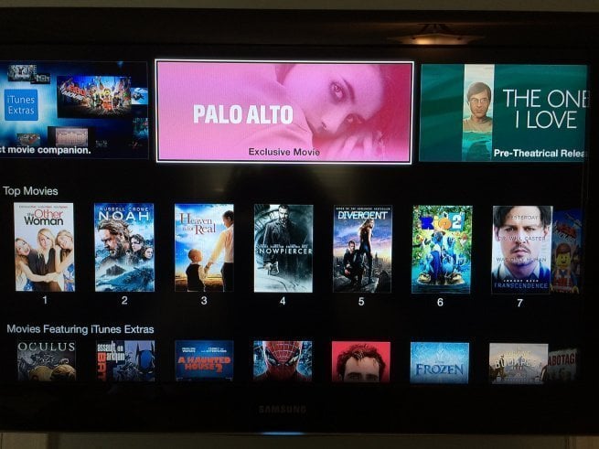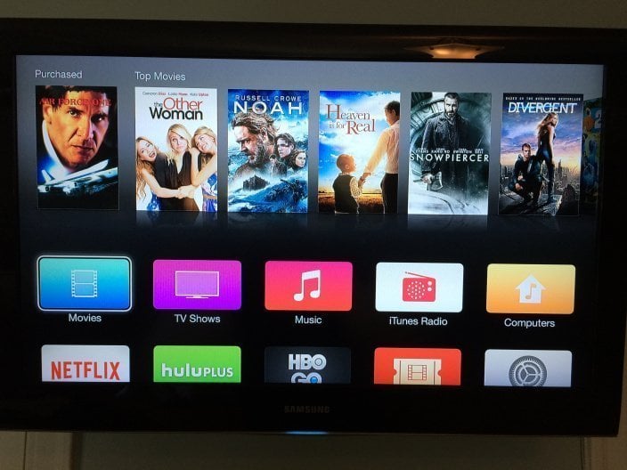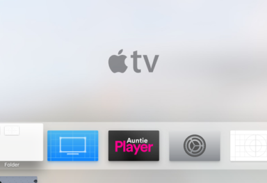
Finally, Apple has decided to change the way your Apple TV interface looks. However, this might not be the redesign you’ve been dreaming of, since the new UI just brings a new set of icons and a new thinner font.
The picture on top shows the redesigned Home Screen. As you can see, the skeuomorphism (if I may say so) has been replaced with flat icons, pretty much similar to the transition from iOS 6 to 7. This iOS7-ization sees dropped shadows, absent reflections, modern looks and thinner fonts. Many channel icons now correspond to their iOS counterparts and sees the use of “a whole new palette of colours“. You can go through a detailed gallery of the interface here at 9to5Mac.
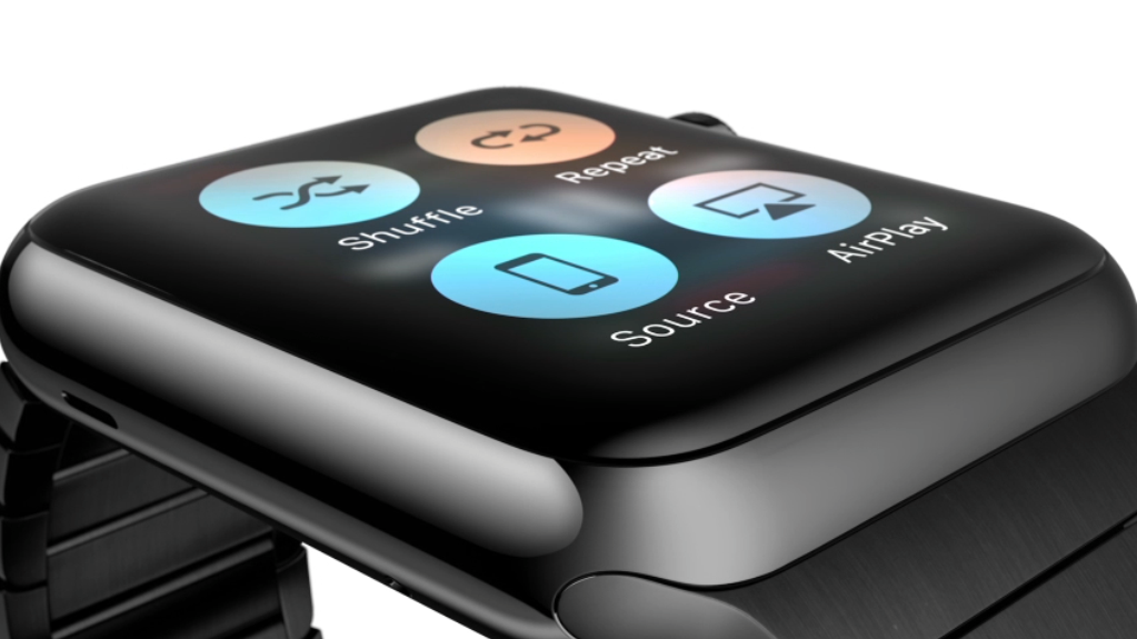
Apple has been regularly releasing the beta versions of iOS 8 and OS X Yosemite and alongside, minor updates to Apple TV firmware are also being pushed out for testing the new iOS-Apple TV combo capabilities. So far, we know that the next major Apple TV update will be bringing Continuity features, peer-to-peer AirPlay and iCloud Family Sharing. The final version of the update will be available to non-developers sometime this fall.
Be sure to follow Apple TV Hacks on Twitter, Facebook or Google+ for all the latest Apple TV-related news.


Comments
Be The First to Comment